
We've rebuilt Kwanda's visual language.
It's the biggest change since we started, and it isn't really about taste. To explain why, I have to go back to the beginning.
Where we started
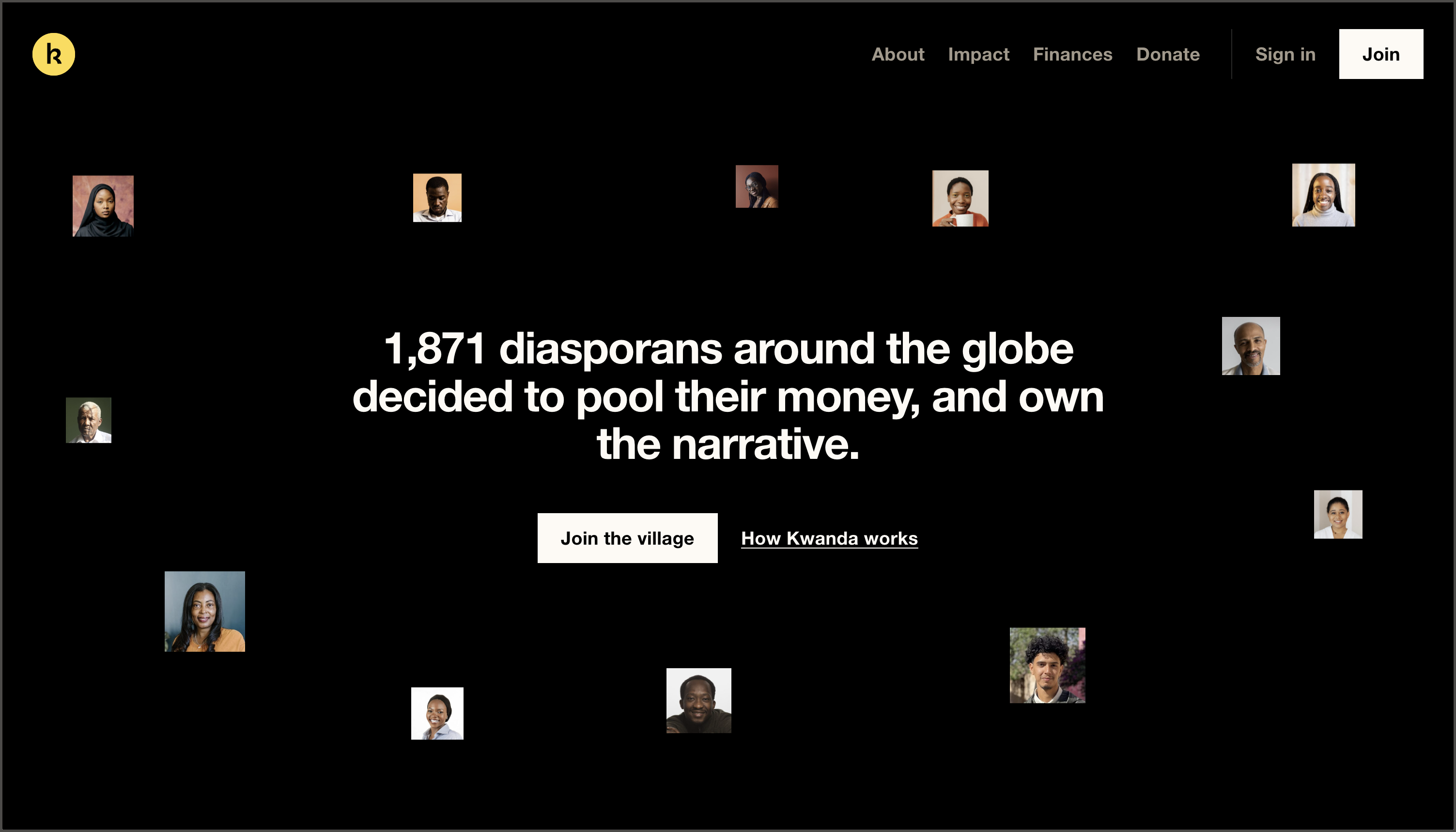
Kwanda began at the start of 2020 as an informal experiment. A group of people putting money in every month to see what would happen if the diaspora funded its own. The look matched that: fun, informal and right for the energy of the platform at the time.
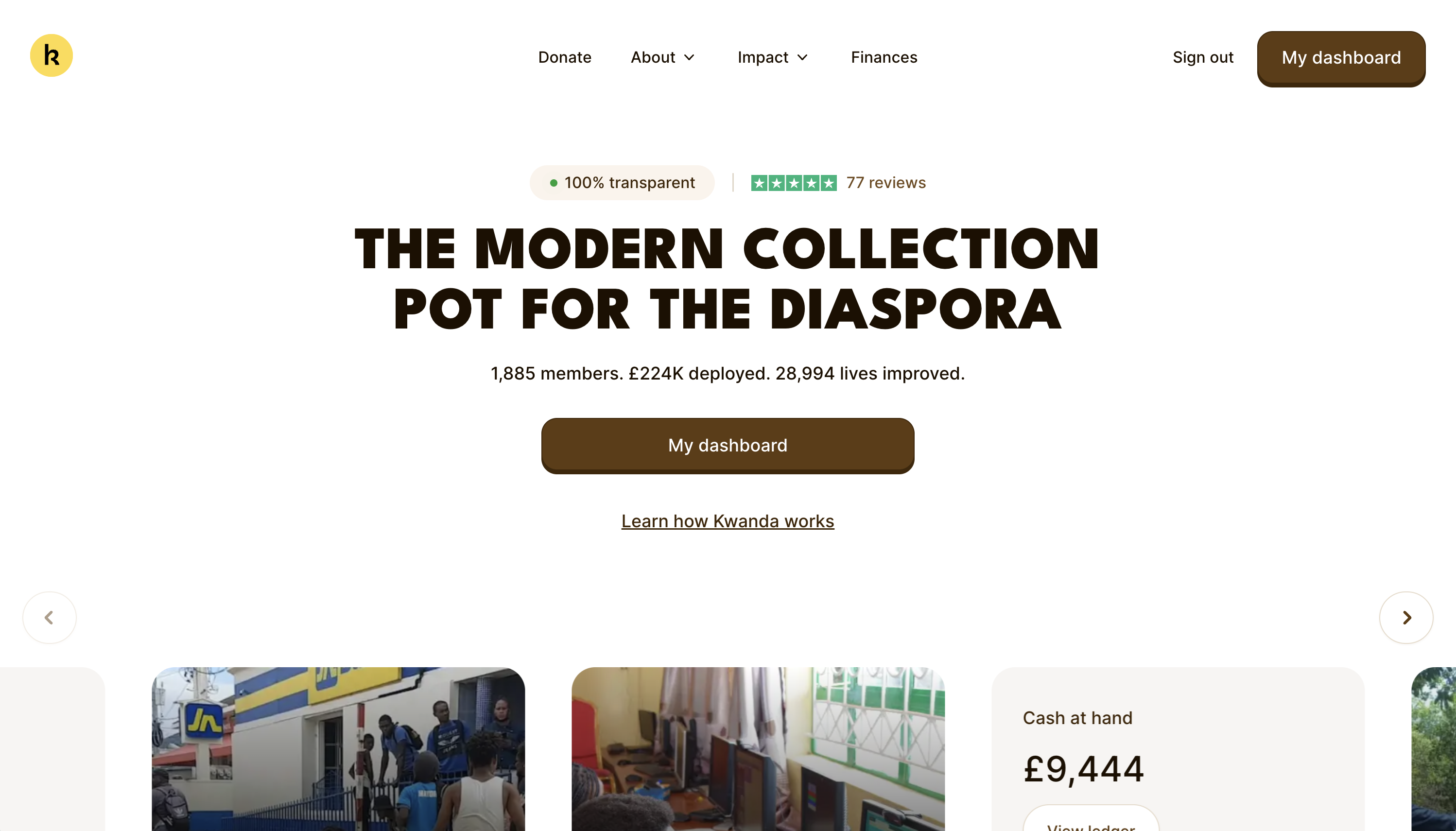
And it worked. That look is part of why people joined, and it carried Kwanda from an idea between friends to a few thousand members funding real work.
We updated and polished it several times over the years, with each revision holding up for a few quarters until it started to look aged.
So we've decided it's time to mature the brand, and bring forward a visual language that matches the scale of impact we've had and intend to have going forward.
Members have deployed £224,125 into projects that have reached 28,999 people, and 1,885 people contribute every month, from 48 countries. A visual front that reads as a side project makes work at that scale harder to believe.
Beyond that are a few other core reasons we've decided to upgrade our visual language:
Numbers should be easy to read
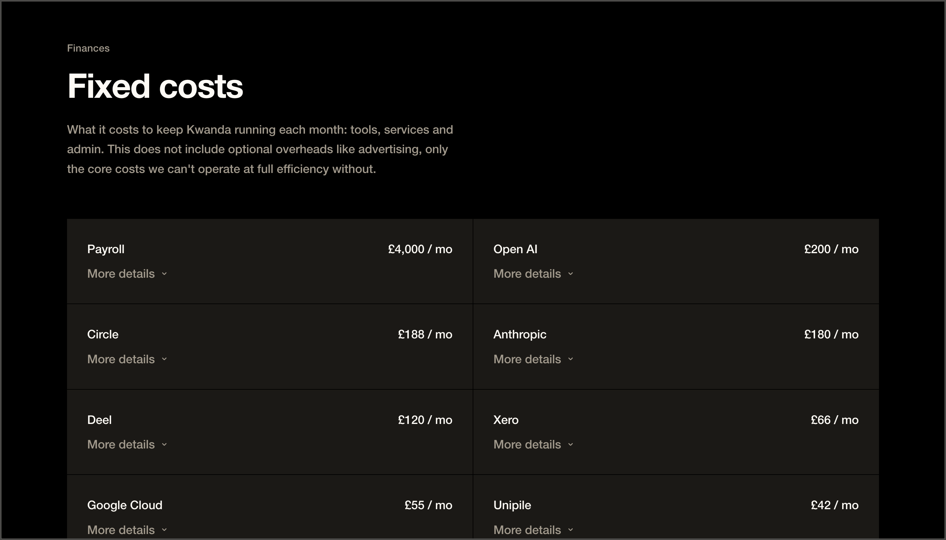
Most of what we publish is information. An open ledger. What we spend each month. How many patients came through a clinic in Lagos. Votes on which project gets funded next. Quarterly reports. Members read all of it from 48 countries, and English isn't everyone's first language.
The old look made that harder than it needed to be. Decoration competed with information, and we spent a lot of time negotiating clarity and flourish.
The new system is built the other way round. Higher contrast, larger text and more room between the lines. This is an accessibility gain as much as a design one: it widens who can access Kwanda without effort, whether that is an older member, someone on a small screen, or someone reading in a second language.
It lets us move faster
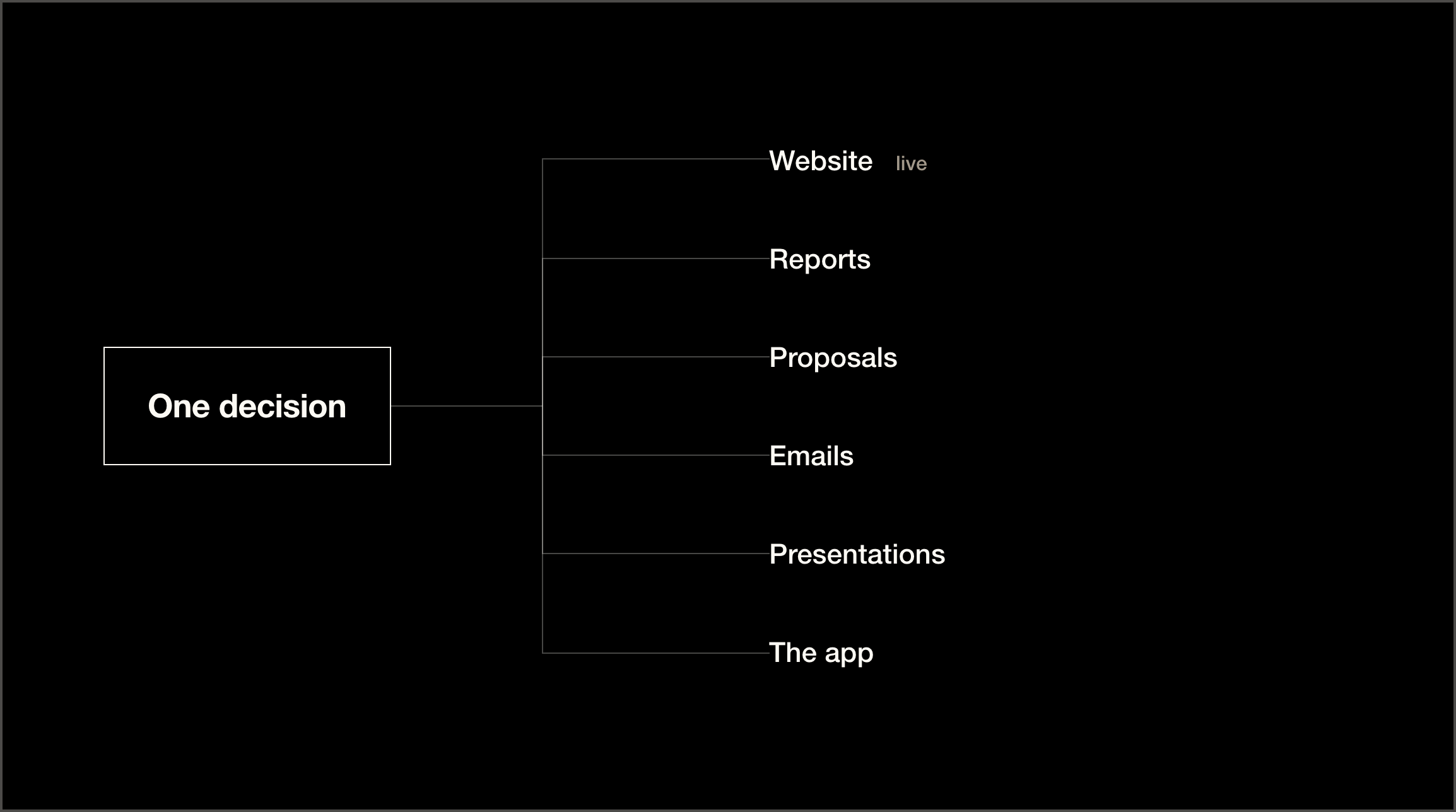
This new visual language gives us the ability to move faster, and communicate our ideas in a widening range of assets.
Every part of the system gets decided once and reused everywhere. A colour, a font size, the way a table sets, how a photograph is cropped. Changes in one place reflect everywhere it appears. Building a new page, a report or a presentation is closer to assembling now than starting over.
For a team our size, that ability to build quickly is essential.
That shows up for members too. Reports reach you sooner because they are assembled rather than rebuilt, and the pages you use most, the ledger, the vote, the project updates, are more accessible.
What it has to carry next
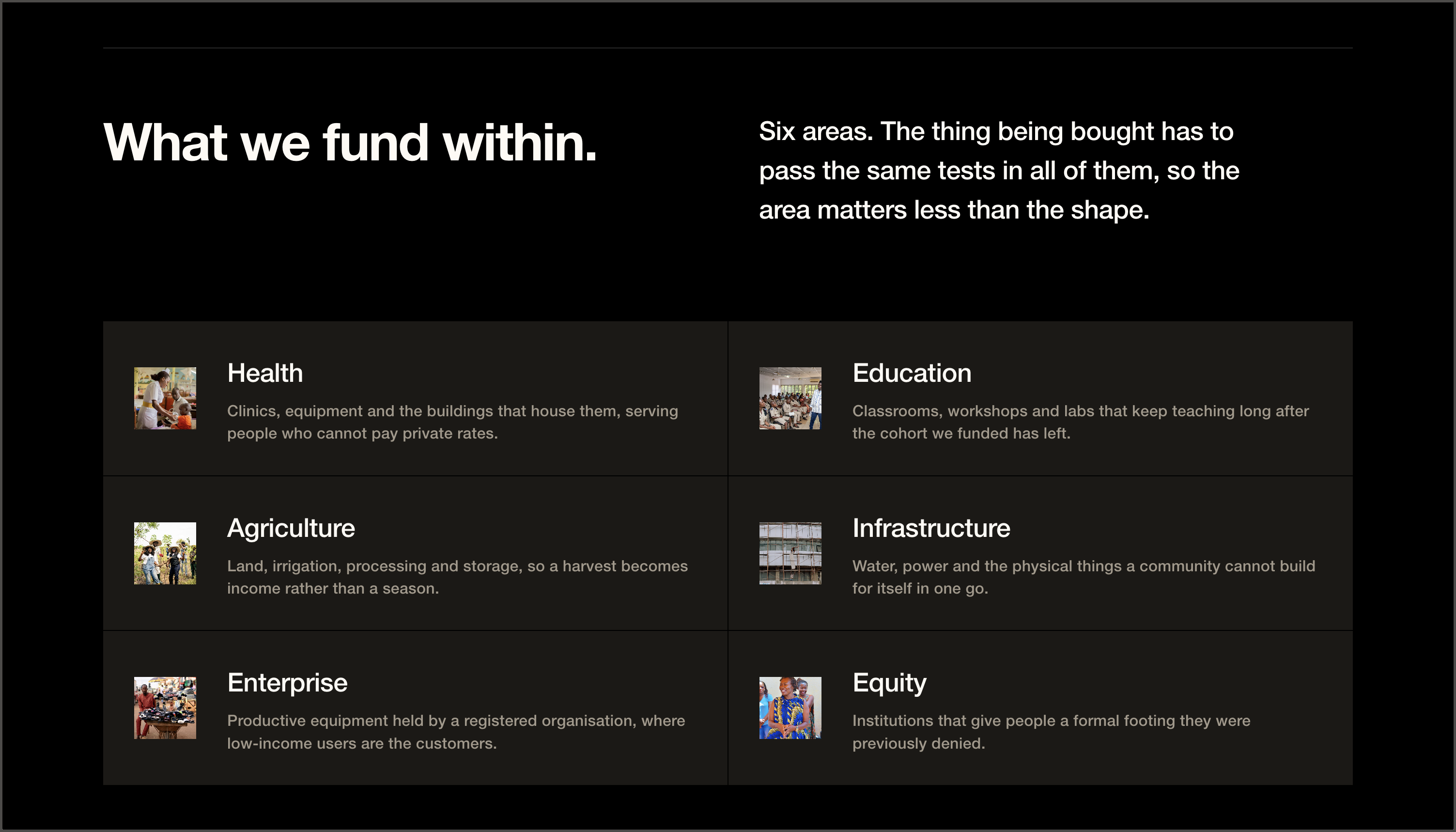
Kwanda is a platform, and we intend to build a lot more on top of it.
Say that in ten years Kwanda runs a bank. Or a fund that invests rather than grants. Or takes on large-scale infrastructure. A playful, game-styled look can't go to those places easily. We'd have to split into two brand looks, or spend years dragging the old style towards a seriousness it was never built for.
So we stripped it back to what the work itself demands. Clear type. Straight lines. Room to breathe. Nothing on the page that isn't doing a job. When you publish an open ledger and ask people to trust it with their money every month, the design's job is to get out of the way of the facts. That holds whether it's a £2,000 pilot or something many times larger.
What hasn't changed
Nothing about how Kwanda works. Members still contribute monthly, still vote on which projects get funded, and the ledger is still open. The projects, the partners and the money all work exactly as they did before. This is a change to how we present the work, not to the work.
It cost nothing
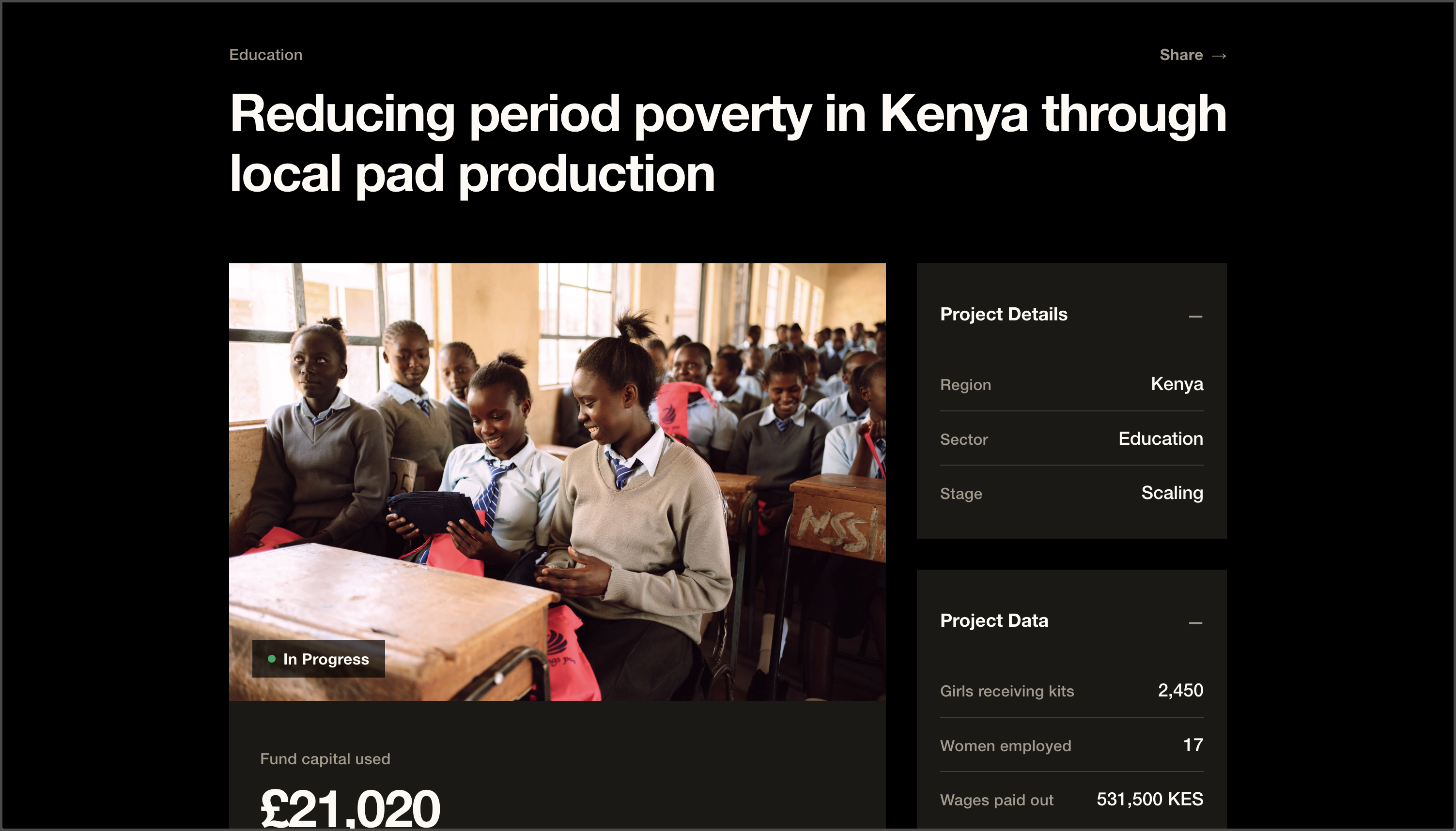
We built it in house. There was no agency and no separate budget, and you will not find a design line in the ledger, because there isn't one. Members' contributions went where they always go.
Where you'll see it
The website goes first. Reports, presentations, the emails we send and the app itself follow over the coming months, until everything Kwanda puts out reads as one thing.
The part we care about more is what it clears the way for. Every new thing we build starts from a system that already holds, instead of from an argument about whether it fits.
If anything reads worse to you than it did before, say so. We would rather hear it early.